

CSS3 经典教程系列:CSS3 线性渐变(linear-gradient)(二)
四、线性渐变在 Trident (IE) 下的应用
语法:
|
1
2
|
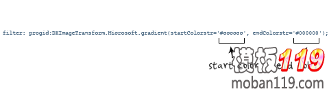
filter: progid:DXImageTransform.Microsoft.gradient(GradientType=0, startColorstr=#1471da, endColorstr=#1C85FB);/*IE<9>*/-ms-filter: "progid:DXImageTransform.Microsoft.gradient (GradientType=0, startColorstr=#1471da, endColorstr=#1C85FB)";/*IE8+*/ |
IE依靠滤镜实现渐变。startColorstr表示起点的颜色,endColorstr 表示终点颜色。GradientType 表示渐变类型,0 为缺省值,表示垂直渐变,1 表示水平渐变。如图所示:
上面我们主要介绍了线性渐变在上述四大核心模块下的实现方法,接着我们主要针对线性渐变在 Mozilla、Webkit、Opera 三大模块下实现各种不同线性渐变实例:
从上面的语法中我们可以很清楚的知道,要创建一个线性渐变,我们需要创建一个起点和一个渐变方向(或角度),定义一个起始色:
|
1
2
3
|
-moz-linear-gradient( [-webkit-linear-gradient( [-o-linear-gradient( [ |
具体应用如下:
|
1
2
3
4
|
background:-moz-linear-gradient(left,#ace,#f96);/*Mozilla*/background:-webkit-gradient(linear,0 50%,100% 50%,from(#ace),to(#f96));/*Old gradient for webkit*/background:-webkit-linear-gradient(left,#ace,#f96);/*new gradient for Webkit*/background:-o-linear-gradient(left,#ace,#f96); /*Opera11*/ |
效果如下:

起始点(Starting Point)的工作方式类似于 background position。您可以设置水平和垂直位置为百分比,或以像素为单位,或在水平方向上可以使用left/center/right,在垂直方向上可以使用top/center/bottom。位置起始于左上角。如果你不指定水平或垂直位置,它将默认为center。其工作方式主要包含:Top → Bottom、Left → Right、bottom → top、right → left等,接着我们主要一种一种来看其实现的效果:
1、开始于center(水平方向)和top(垂直方向)也就是Top → Bottom:
|
1
2
3
4
5
6
7
8
9
|
/* Firefox 3.6+ */background: -moz-linear-gradient(top, #ace, #f96);/* Safari 4-5, Chrome 1-9 *//* -webkit-gradient(, [, ]?, [, ]? [, ]*) */background: -webkit-gradient(linear,top,from(#ace),to(#f96));/* Safari 5.1+, Chrome 10+ */background: -webkit-linear-gradient(top, #ace, #f96);/* Opera 11.10+ */background: -o-linear-gradient(top, #ace, #f96); |
效果:

2、始于left(水平方向)和center(垂直方向)也是就Left → Right:
|
1
2
3
4
5
6
|
/* Firefox 3.6+ */background: -moz-linear-gradient(left, #ace, #f96);/* Safari 5.1+, Chrome 10+ */background: -webkit-linear-gradient(left, #ace, #f96);/* Opera 11.10+ */background: -o-linear-gradient(left, #ace, #f96); |
效果如下:

3、起始于left(水平方向)和top(垂直方向):
|
1
2
3
|
background: -moz-linear-gradient(left top, #ace, #f96);background: -webkit-linear-gradient(left top, #ace, #f96);background: -o-linear-gradient(left top, #ace, #f96); |
效果如下:

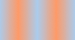
4、Linear Gradient (with Even Stops):
|
1
2
3
4
5
6
7
8
|
/* Firefox 3.6+ */background: -moz-linear-gradient(left, #ace, #f96, #ace, #f96, #ace);/* Safari 4-5, Chrome 1-9 */background: -webkit-gradient(linear, left top, right top, from(#ace), color-stop(0.25, #f96), color-stop(0.5, #ace), color-stop(0.75, #f96), to(#ace));/* Safari 5.1+, Chrome 10+ */background: -webkit-linear-gradient(left, #ace, #f96, #ace, #f96, #ace);/* Opera 11.10+ */background: -o-linear-gradient(left, #ace, #f96, #ace, #f96, #ace); |
效果如下:
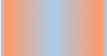
5、with Specified Arbitrary Stops:
|
1
2
3
4
5
6
7
8
|
/* Firefox 3.6+ */ background: -moz-linear-gradient(left, #ace, #f96 5%, #ace, #f96 95%, #ace); /* Safari 4-5, Chrome 1-9 */ background: -webkit-gradient(linear, left top, right top, from(#ace), color-stop(0.05, #f96), color-stop(0.5, #ace), color-stop(0.95, #f96), to(#ace)); /* Safari 5.1+, Chrome 10+ */ background: -webkit-linear-gradient(left, #ace, #f96 5%, #ace, #f96 95%, #ace); /* Opera 11.10+ */ background: -o-linear-gradient(left, #ace, #f96 5%, #ace, #f96 95%, #ace); |
效果如下:
本文手机访问二维码

☉本站的源码不会像其它下载站一样植入大量的广告。
☉本站只提供精品织梦源码,源码在于可用,不在多!!希望在这里找到你合适的。
☉本站提供的整站织梦程序,均带数据及演示地址。可以在任一源码详情页查看演示地址
☉本站所有资源(包括源码、模板、素材、特效等)仅供学习与参考,请勿用于商业用途。
☉如有其他问题,请加网站客服QQ(971977809)进行交流

")


程序开发


")